DiPiú: Branding
Di Piú, from the Italian "I want more", was born from the need to express the traditional art of making fresh pasta and the genuine homemade flavors associated with the desire to be part of the current global change in social food, offering healthy as well as tasty products.
Created by professional chef Jonathan Lauriola, to market his homemade recipes
Credits
I developed this project at Rockout in 2012
Art Director / Designer: Ivan Bogar
Role
Concept, Development and Visuals
Conception
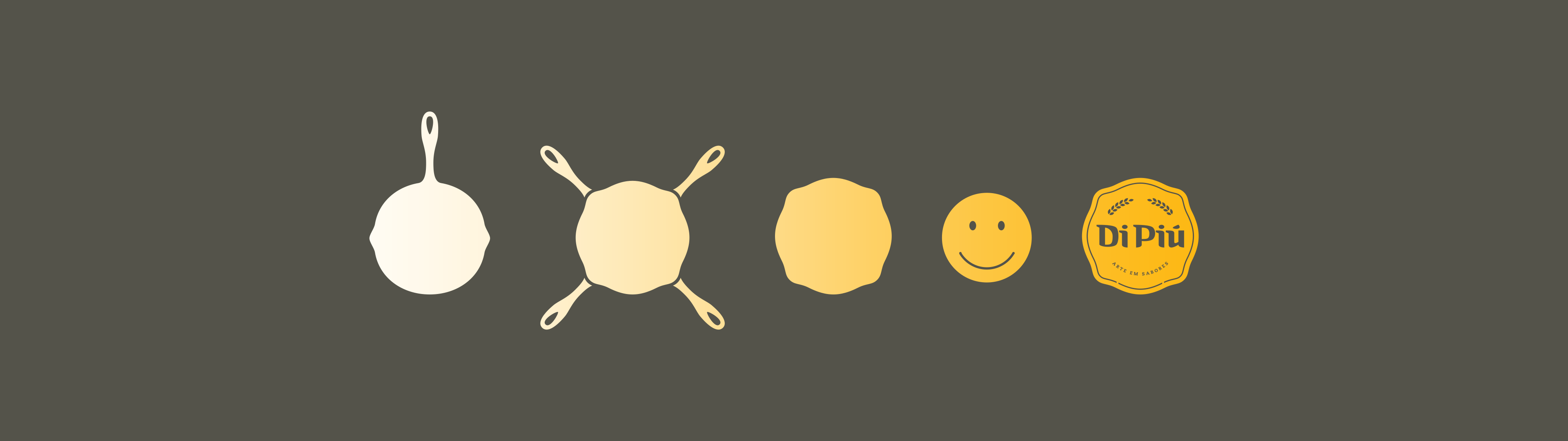
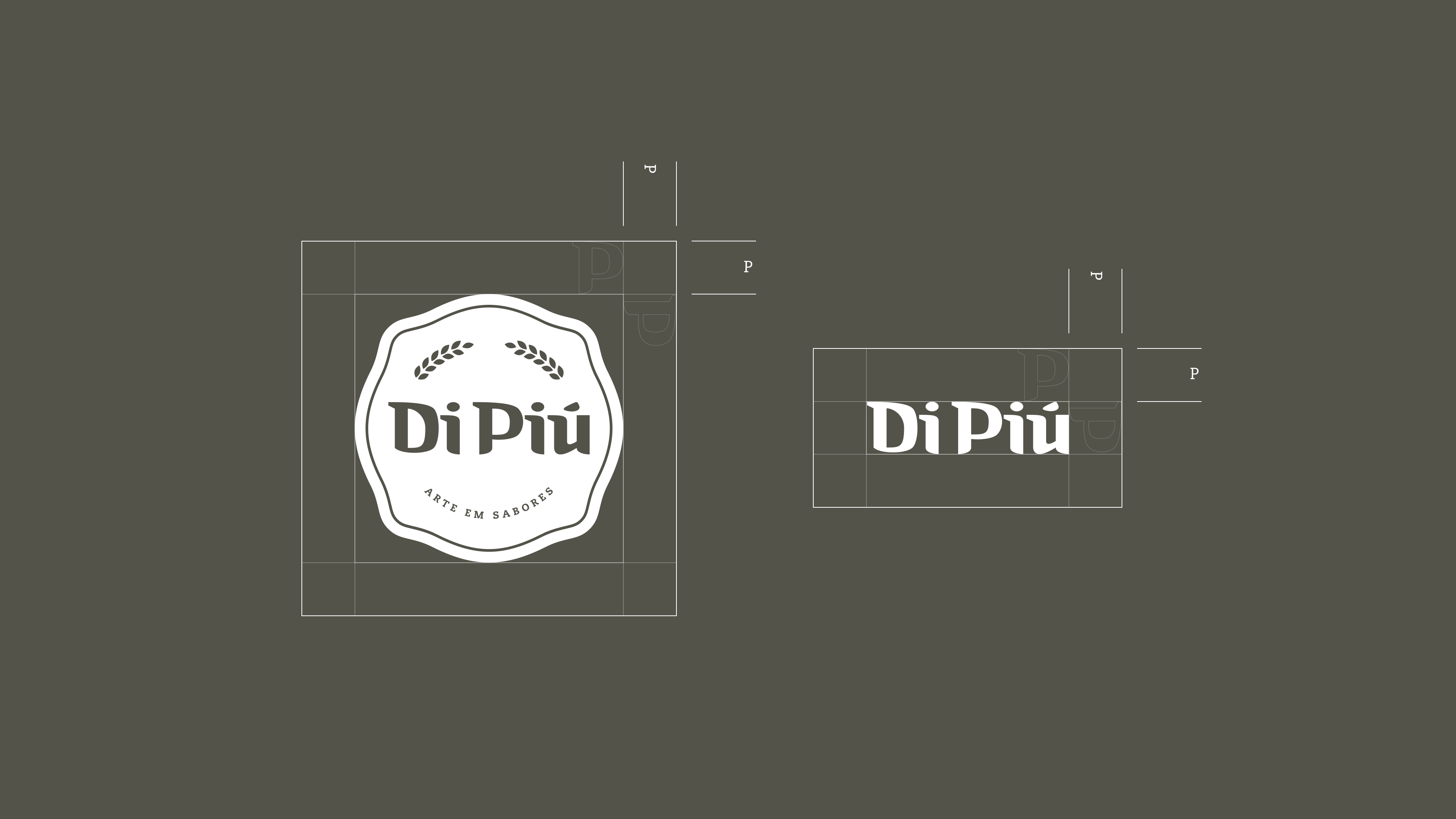
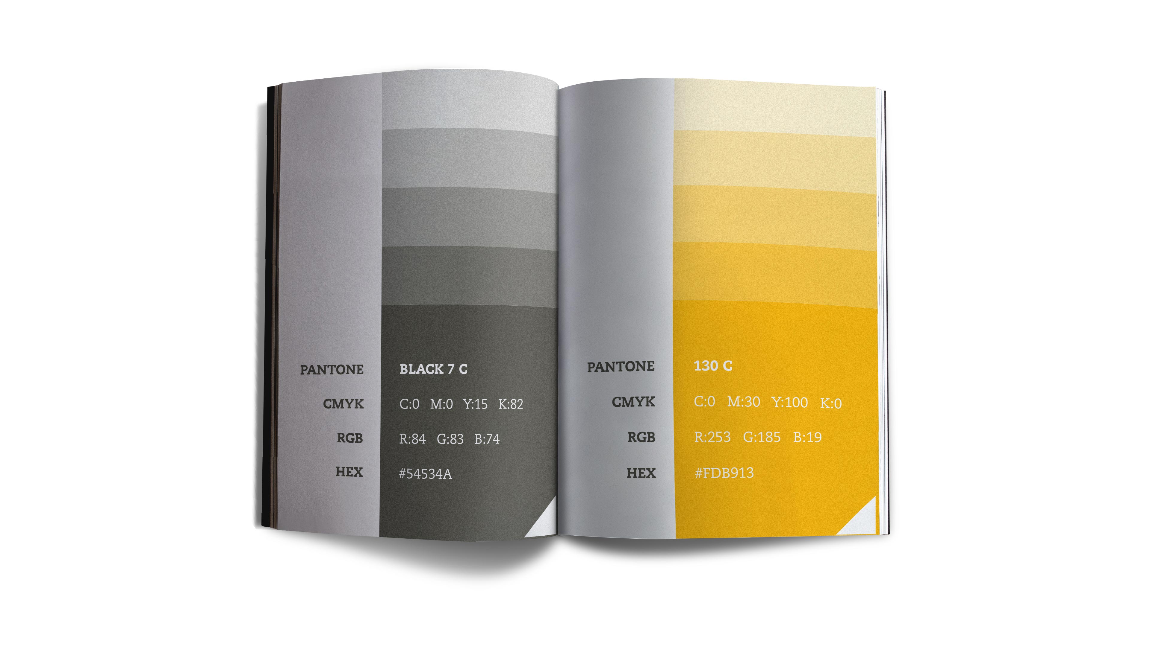
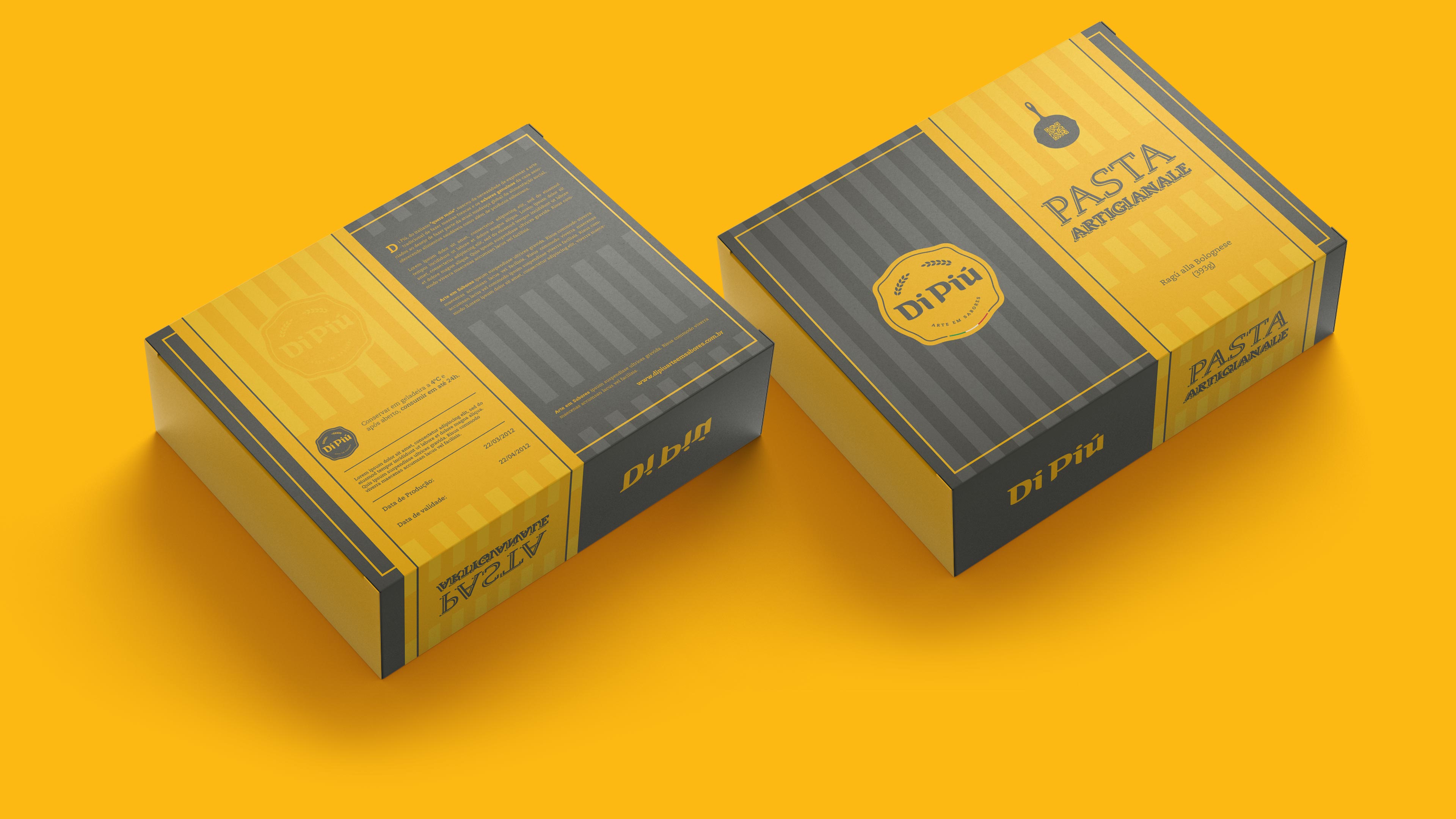
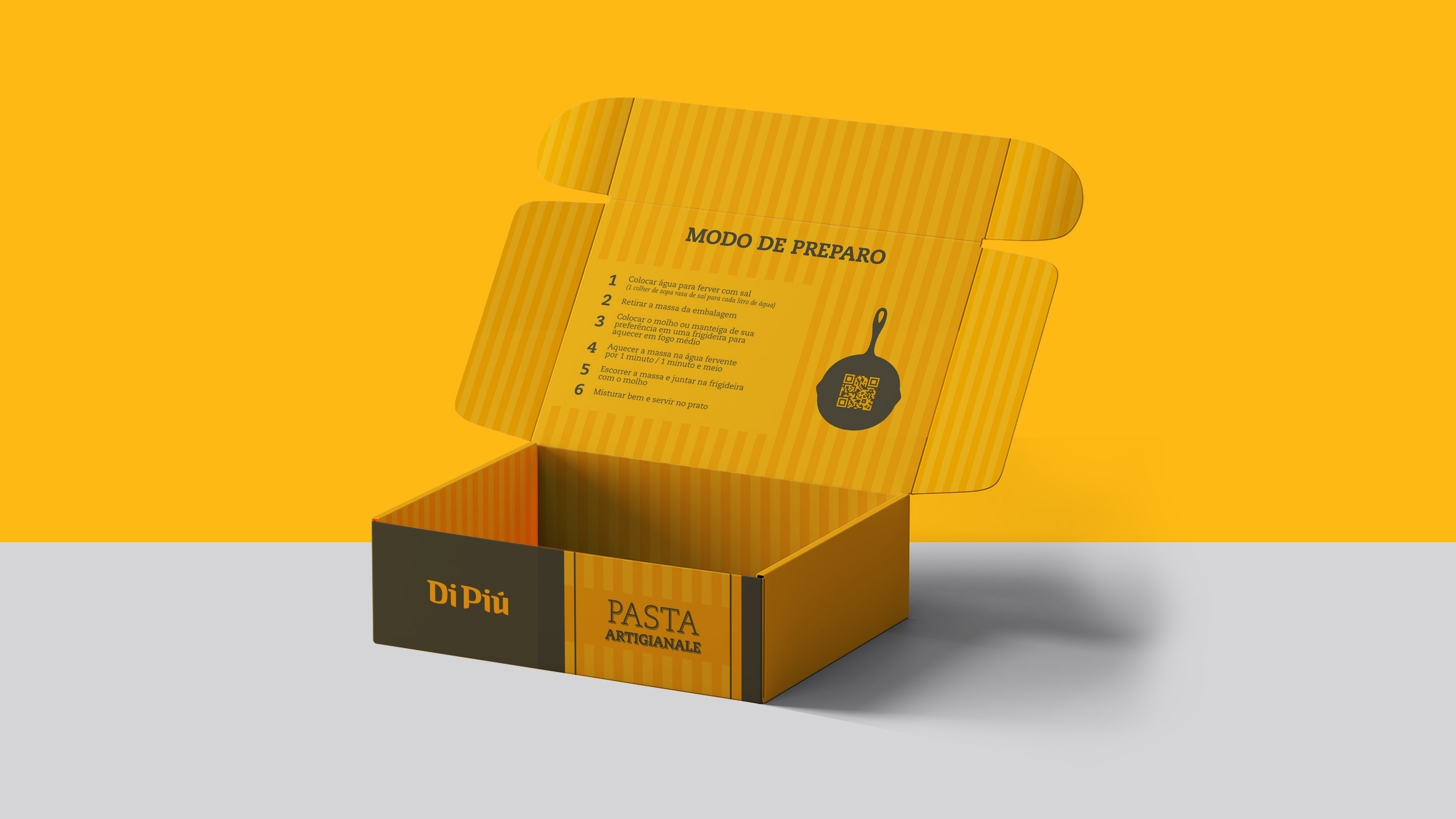
The visual search was very spontaneous. I used the shape of a traditional frying pan and did some tests with the shapes. So I used the iron colors that naturally created a perfect contrast with delicious pasta.

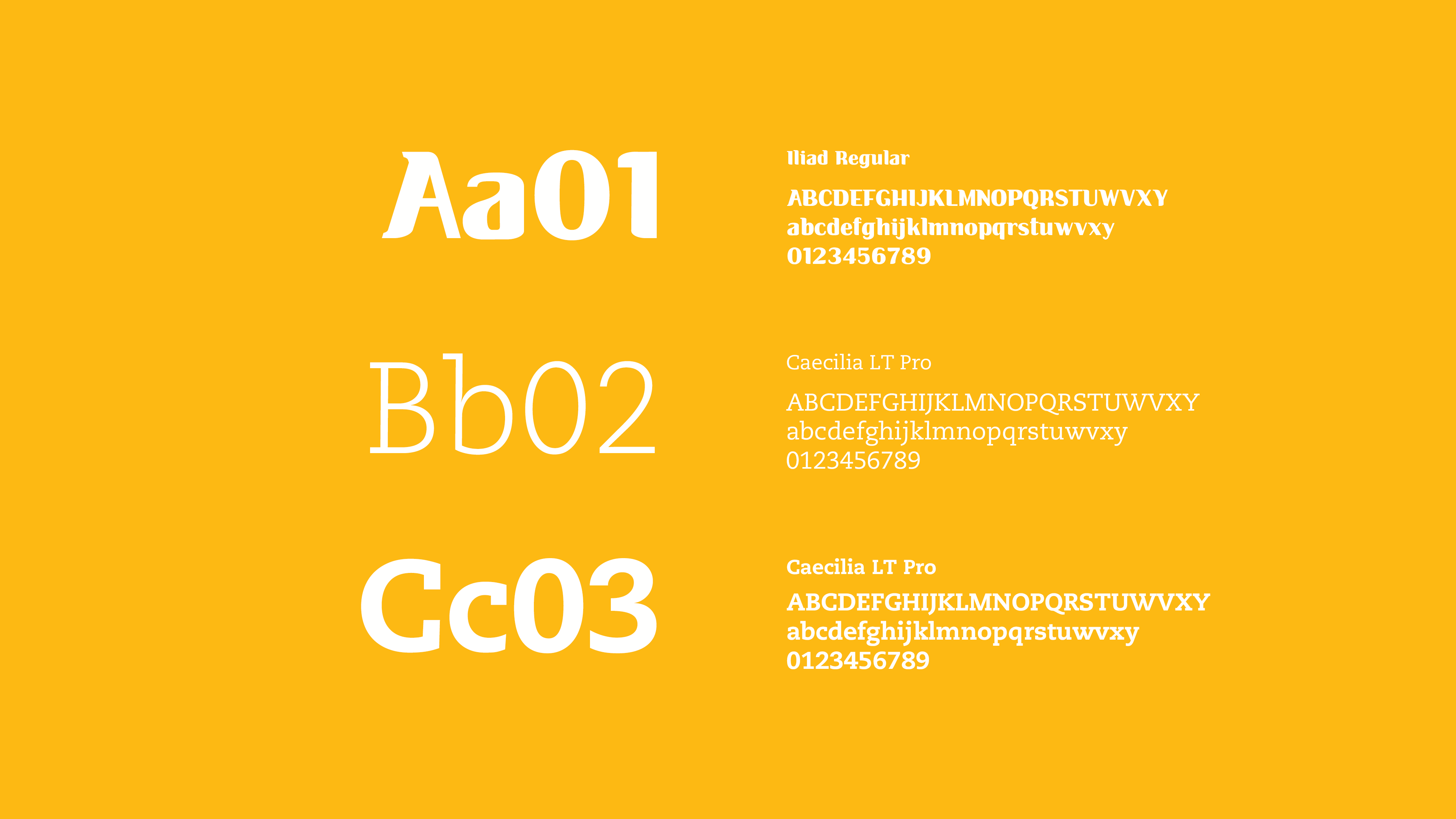
Typography
Color Palette
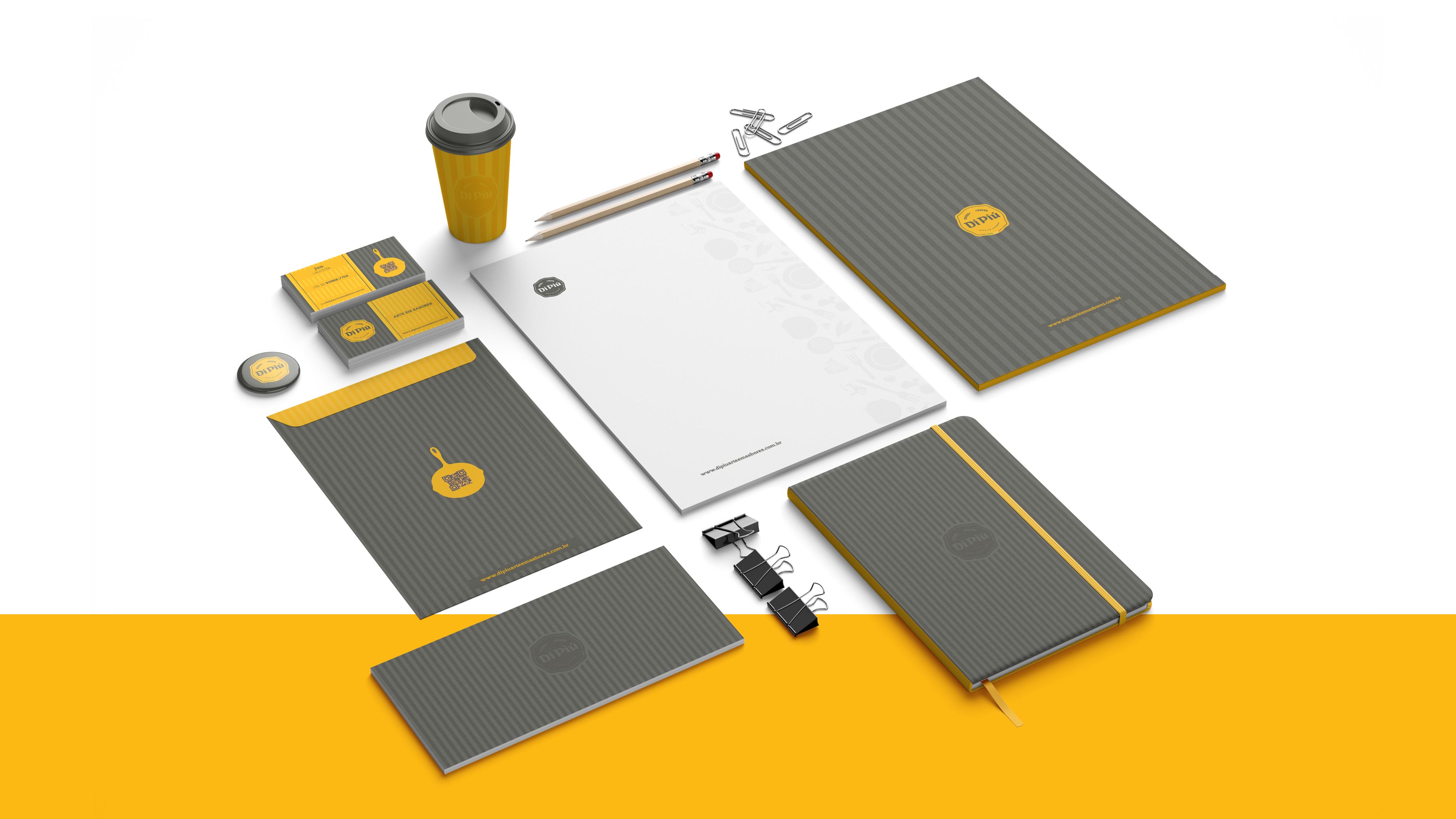
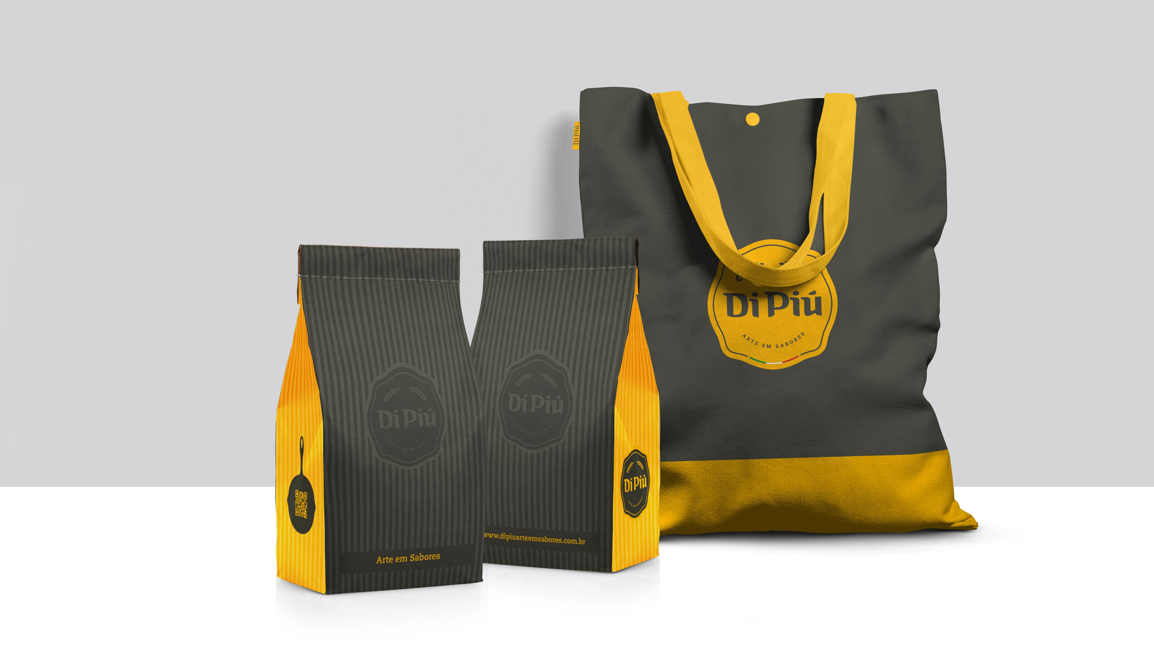
Packages
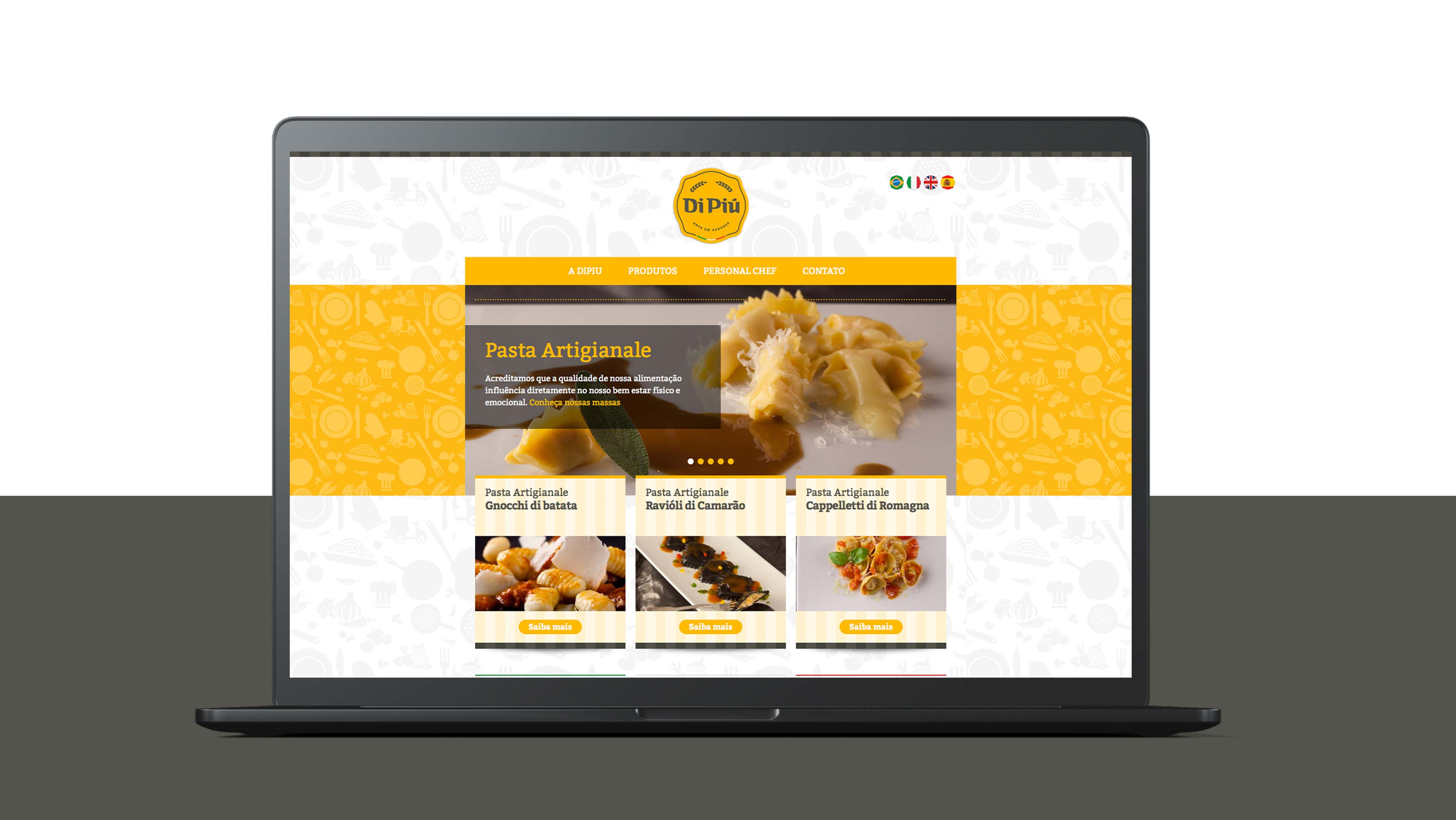
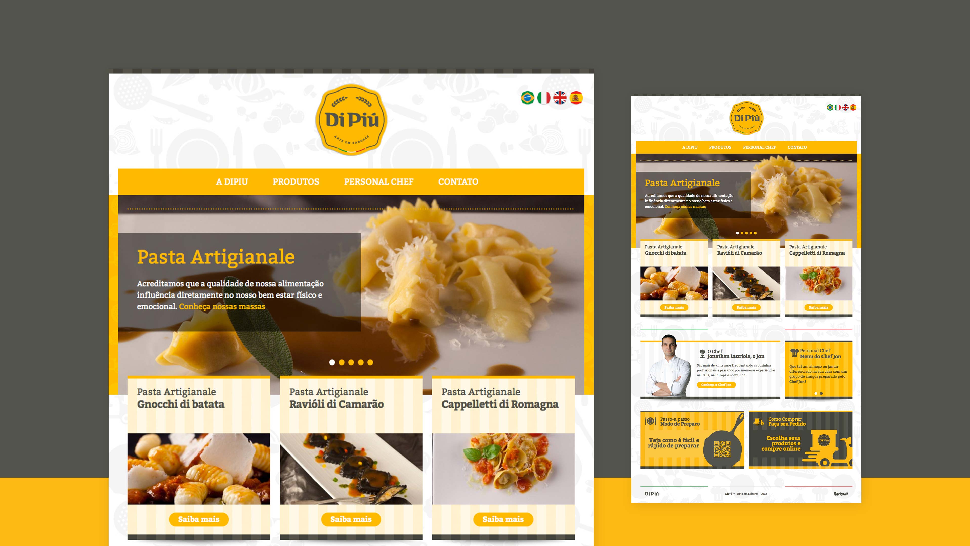
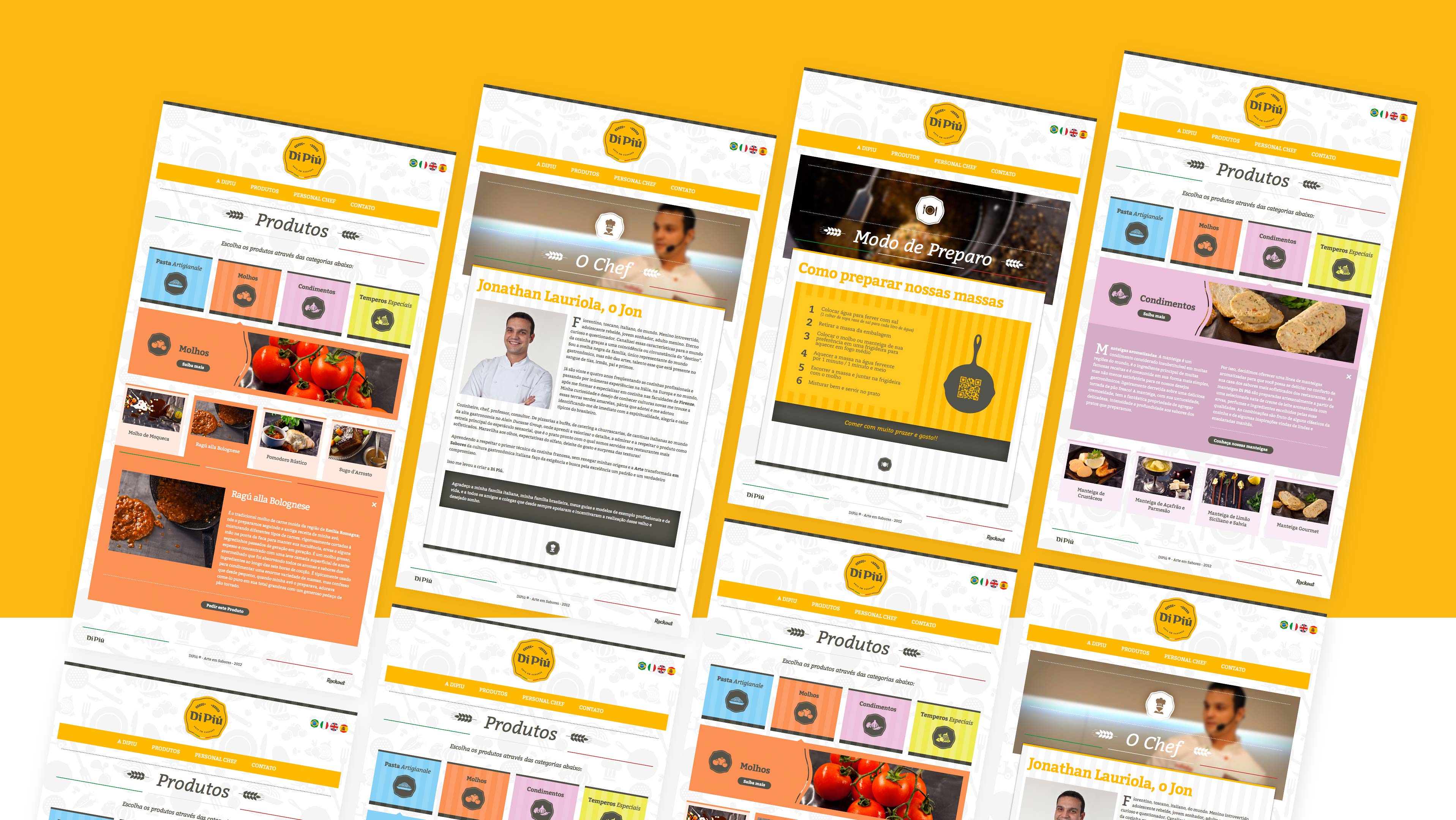
Site